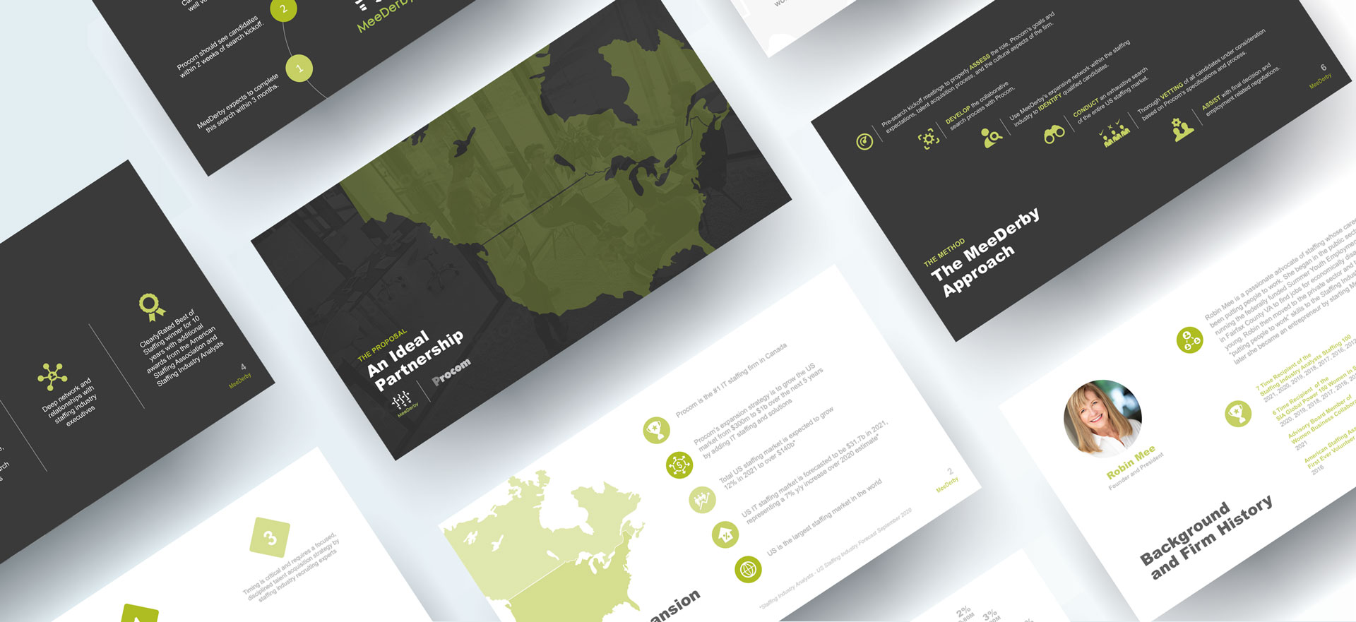
MeeDerby Brand Enhancement
Branding. Keeping it real. And fresh.
With new business partnerships in their sights, MeeDerby tapped TerraFirma to freshen up their branded look. It's common knowledge that a brand has be fluid and adaptable – yet remain consistent and familiar. It's a delicate balancing act that needs to be well-conceived and strategically sound.
While staying true to MeeDerby's corporate color palette, our design team introduced a contemporary design pattern that utilized infographics, a stylized photo treatment and a more modern font family. The client was thrilled with their new presentation materials and immediately put them to use in order to close a pending business deal. Call it a win-win.

A little can go a long way.
As part of the brand refresh, TerraFirma took a closer look at Mee Derby's logo. Having stood the test of time, we knew it had earned substantial brand equity. Still, the client felt it needed to be tweaked. Armed with the understanding that major changes weren't an option, our design team went to work.
It was clear that the faces above the name were the cornerstone of the logo. Iconic, memorable and in the client's eyes, sacred. And we agreed. We then shifted our focus to the font used in the company's name – mee derby (two words, no capitalized letters).
While we respected the aesthetic of the logo being used, we took it upon ourselves to be more strategic. Since mee and derby are proper names and represent the original business partnership, we thought it made sense to capitalize the first letter of each name. Second, we decided to bring the names together to visually reinforce that partnership, rather than keeping the two names separate. The result was MeeDerby. While the change was subtle, the client was delighted and the project breathed even more life into the TerraFirma mantra – simple really can be strategic.
The Mee Derby logo needed a refresh and the TeraFirma team delivered. Their combination of staffing expertise, great creative and collaborative style made the process fun and productive. I highly recommend TerraFirma Marketing.- Robin Mee, President
